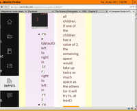


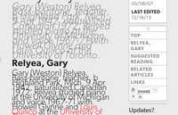


Here are more than 300 examples of broken websites I have come across over the last several years. Most are the result of not taking into account the fact that not all viewers use the same font size as the designer of the page. Some are the result of forgetting to specify a background colour (e.g. this). (My browser defaults to a pale yellow background.)
The results range from mildy inconvenient to totally undreadable. Some will have been fixed by now, others continue in blissful ignorance.
Perhaps the most distressing thing about this collection is how many are "professional" web designers' own sites. And, of course, many more are designed by "professional" web designers.
(The scripts that generate these pages need a little work, but the section is mostly usable.)